Showing posts with label Design Practice 2. Show all posts
Showing posts with label Design Practice 2. Show all posts
Sunday, 10 July 2011

Thursday, 26 May 2011
First Year Over :)
Did my presentation today, went alrighttttt! After many tears & tantrums first year finally over
:) :)
:) :)
Monday, 23 May 2011
Last Week Of The First Year..
& I have finished all 3 of my projects - my interactive I feel being the strongest, animation obviously the weakest.
I have finished my assessment presentation & will upload it on here soon!
My visual essay after so much time & research is nearly complete :)
I have finished my assessment presentation & will upload it on here soon!
My visual essay after so much time & research is nearly complete :)
Friday, 20 May 2011
One Week To Go..
until deadline for visual essay & presentation.
Have just uploaded my interactive media & evaluation to the dropbox - also made it live.
My visual essay and presentation are about halfway through, have just got an email saying Waverley is closed for 4 weeks from next week which is brilliant as I was hoping to edit my film & animation.
I am going to try and improve my animation now but my track record with it this plan may not go too well! also if I have time will do my own edit for film Herds.
Also need to make dvds today if Waverley is closed?!
Have just uploaded my interactive media & evaluation to the dropbox - also made it live.
My visual essay and presentation are about halfway through, have just got an email saying Waverley is closed for 4 weeks from next week which is brilliant as I was hoping to edit my film & animation.
I am going to try and improve my animation now but my track record with it this plan may not go too well! also if I have time will do my own edit for film Herds.
Also need to make dvds today if Waverley is closed?!
Thursday, 19 May 2011
Interactive Media Evaluation
For this project we were set the task to create an online portfolio of our work, consisting of 5 link pages.
My main ideas and intentions that I was trying to express in the project were: that this is my online portfolio of my work, to advertise myself & my work for clients so it had to be professional but also wanted a sense of my personality to come across through the design such as colours, images & texts I used. There was no set “theme” as such for my project some people for example had pop art or a circus theme. I kept to the same background & colour scheme throughout which reflected me as a person such as pink text.
The methods I use to develop my ideas were: (brainstorming, , visual research, storyboards etc)
The methods I used to develop my ideas can all me seen on my blog posts over the duration of the project. I created a mood board at the start of the project to on the IMGSPARK website; there is a colour theme of pink - hence being my favourite colour. I like "girly" things such as make up, shoes, my boyfriend. The mood board portrayed me well as someone whom has never spoken to me could guess my personality from this. Doing the mood board did give me ideas for my portfolio - such as themes I could use, what I wanted to include in the portfolio & how much I could put onto the portfolio to make it about me as much as possible. There was also the idea of personal branding – “involves the application of one's name to various products.” I also created wire frames which both looked like simple layouts but with images, backgrounds and text it improved the look. I didn’t want to design anything too complicated that I had to follow as I would have ended up getting frustrated,I started with something simple that changed along the way as I got more advanced. To develop my ideas I also looked on other websites that I really found appealing – Kate Nash, Rihanna & The Orange Tree website all in different ways gave me inspirations for my own portfolio.
I took a risk by trying something new. (Explain): I feel my portfolio is quite different to those in my group. Like I said I wanted the personality of me to come across in it, so pink text & busy background images may not come off as professional but they create the theme that I wanted & I feel it works well.
Some of the unexpected problems I had to solve while working were: Interactive is my favourite as I find the software dreamweaver a lot easier to use than other software such as 3dmax and premier pro. A problem I came across though was when trying to make my website live as some of the images wouldn’t appear, I then realised it was as some of them were named in capitals – ie “CONTACT” not “contact” & this was pretty easy to fix when I realised.
The decisions and choices I made to help solve these problems were: This is quite hard to answer unlike the other 2 projects in which I had a few problems because I really enjoyed this project & I think that was mainly down to the fact that I didn’t have any problems & everything I had planned did work. Obviously not all the codes worked such as when I tried to align a photo the right I wasn’t sure how to do it so looked on w3schools.com which was brilliant for simple codes.
The things I have learnt from this particular project were: (Specific examples should be cited.)
I think that going straight into it & making a website wouldn’t have turned out as well as I think mine did if without the planning. Looking at other websites really helped inspire me into colours to use, image to text ratio & layout. I think it’s also important to try a few different layouts to see what’s best. For example I tried putting text and images in different places on the page to see what looked best as the final design. Producing the mood board helped me with specific ideas for my theme. Also it was important to check my website worked in all internet pages eg firefox, internet explorer, safari & google chrome as some people in my group had problems with this - mine works in all, although looks best in internet explorer.
Areas for improvement , If I were to do this project again I would change or do differently: Unlike the other 2 projects in which I could have made more than one change, I am very happy with my final product for this brief. To improve it I could have added a flash gallery which I did initially have to start with but as I have two different pages one for video another for gallery, both looked a bit bare but when I have created more work then I will add a flash gallery. After submitting to the dropbox I realise I haven’t added my logo! As this is a project will keep updated anyway I will upload it soon.
A new project that might grow out of my experience maybe: as this is my chosen pathway I am hoping a lot of projects will come out of this. I can improve my html skills over the summer & hopefully be able to produce a website for a client.
The domain is : http://hollieferguson.net46.net/HollieFerguson_InteractiveMediaProject_DP2/indextest.html
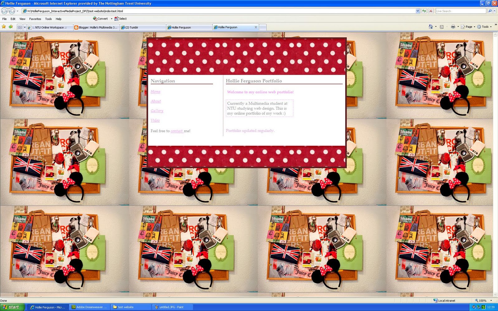
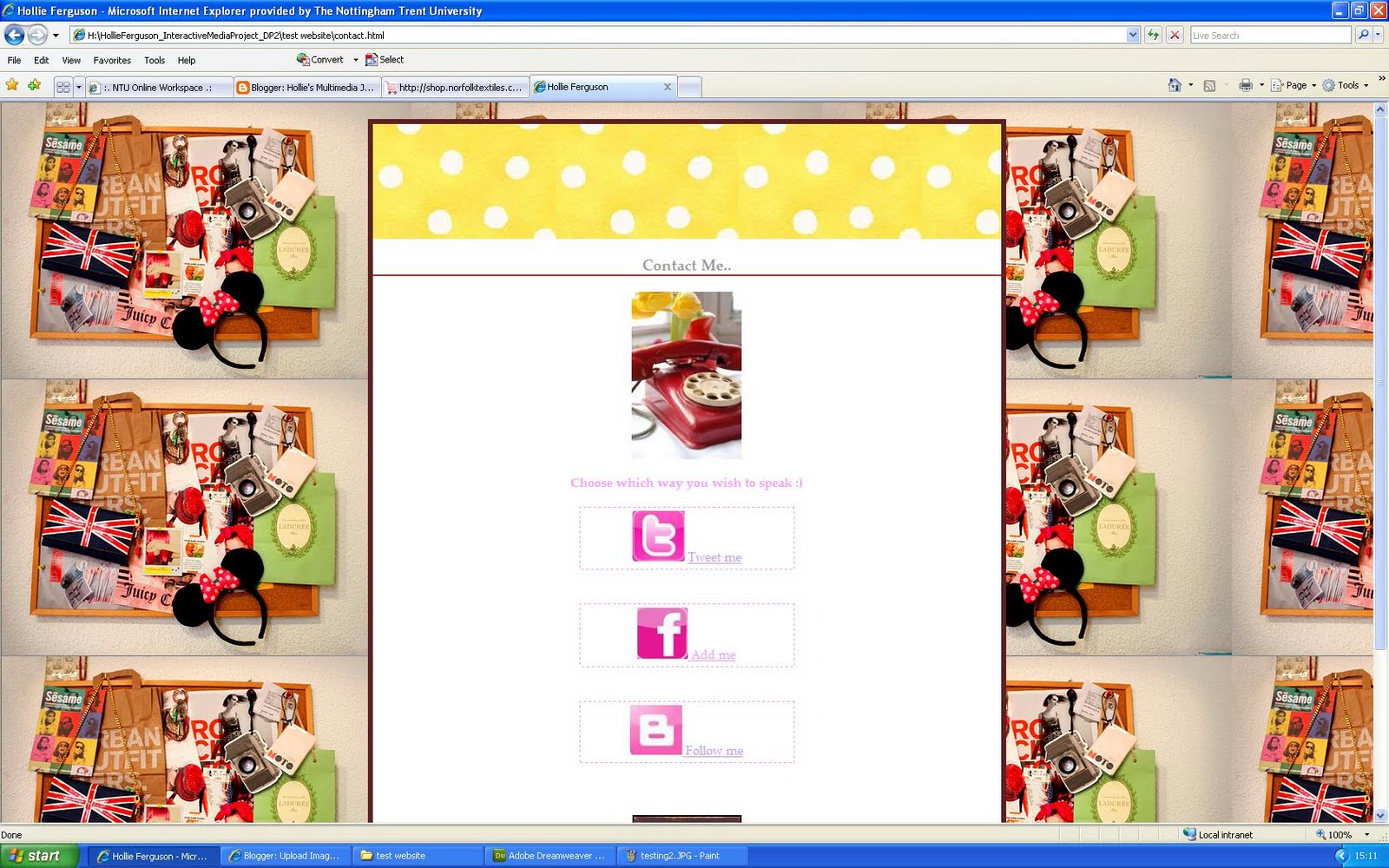
Screen shot images:


My main ideas and intentions that I was trying to express in the project were: that this is my online portfolio of my work, to advertise myself & my work for clients so it had to be professional but also wanted a sense of my personality to come across through the design such as colours, images & texts I used. There was no set “theme” as such for my project some people for example had pop art or a circus theme. I kept to the same background & colour scheme throughout which reflected me as a person such as pink text.
The methods I use to develop my ideas were: (brainstorming, , visual research, storyboards etc)
The methods I used to develop my ideas can all me seen on my blog posts over the duration of the project. I created a mood board at the start of the project to on the IMGSPARK website; there is a colour theme of pink - hence being my favourite colour. I like "girly" things such as make up, shoes, my boyfriend. The mood board portrayed me well as someone whom has never spoken to me could guess my personality from this. Doing the mood board did give me ideas for my portfolio - such as themes I could use, what I wanted to include in the portfolio & how much I could put onto the portfolio to make it about me as much as possible. There was also the idea of personal branding – “involves the application of one's name to various products.” I also created wire frames which both looked like simple layouts but with images, backgrounds and text it improved the look. I didn’t want to design anything too complicated that I had to follow as I would have ended up getting frustrated,I started with something simple that changed along the way as I got more advanced. To develop my ideas I also looked on other websites that I really found appealing – Kate Nash, Rihanna & The Orange Tree website all in different ways gave me inspirations for my own portfolio.
I took a risk by trying something new. (Explain): I feel my portfolio is quite different to those in my group. Like I said I wanted the personality of me to come across in it, so pink text & busy background images may not come off as professional but they create the theme that I wanted & I feel it works well.
Some of the unexpected problems I had to solve while working were: Interactive is my favourite as I find the software dreamweaver a lot easier to use than other software such as 3dmax and premier pro. A problem I came across though was when trying to make my website live as some of the images wouldn’t appear, I then realised it was as some of them were named in capitals – ie “CONTACT” not “contact” & this was pretty easy to fix when I realised.
The decisions and choices I made to help solve these problems were: This is quite hard to answer unlike the other 2 projects in which I had a few problems because I really enjoyed this project & I think that was mainly down to the fact that I didn’t have any problems & everything I had planned did work. Obviously not all the codes worked such as when I tried to align a photo the right I wasn’t sure how to do it so looked on w3schools.com which was brilliant for simple codes.
The things I have learnt from this particular project were: (Specific examples should be cited.)
I think that going straight into it & making a website wouldn’t have turned out as well as I think mine did if without the planning. Looking at other websites really helped inspire me into colours to use, image to text ratio & layout. I think it’s also important to try a few different layouts to see what’s best. For example I tried putting text and images in different places on the page to see what looked best as the final design. Producing the mood board helped me with specific ideas for my theme. Also it was important to check my website worked in all internet pages eg firefox, internet explorer, safari & google chrome as some people in my group had problems with this - mine works in all, although looks best in internet explorer.
Areas for improvement , If I were to do this project again I would change or do differently: Unlike the other 2 projects in which I could have made more than one change, I am very happy with my final product for this brief. To improve it I could have added a flash gallery which I did initially have to start with but as I have two different pages one for video another for gallery, both looked a bit bare but when I have created more work then I will add a flash gallery. After submitting to the dropbox I realise I haven’t added my logo! As this is a project will keep updated anyway I will upload it soon.
A new project that might grow out of my experience maybe: as this is my chosen pathway I am hoping a lot of projects will come out of this. I can improve my html skills over the summer & hopefully be able to produce a website for a client.
The domain is : http://hollieferguson.net46.net/HollieFerguson_InteractiveMediaProject_DP2/indextest.html
Screen shot images:


Monday, 16 May 2011
Thursday, 12 May 2011
Social Networking..
Todays lecture ( and the last one of the year! ) was on social networking, we discussed twitter, facebook and various other networks. Shaun showed us his personal facebook page & then his own facebook page which was effectively like an online portfolio - nothing from his personal facebook just work he wanted to show - I am going to make one of these.
Also linked my facebook, twitter, vimeo & blogger to my website! :)
Not many people in the lecture had twitter although I have had mine a while now & not only use it to tweet about what i'm doing but it's really good for finding out news, celebrity gossip & jobs are always advertised on there if you search for it.
Also linked my facebook, twitter, vimeo & blogger to my website! :)
Not many people in the lecture had twitter although I have had mine a while now & not only use it to tweet about what i'm doing but it's really good for finding out news, celebrity gossip & jobs are always advertised on there if you search for it.
Wednesday, 11 May 2011
Presentation
I'm presenting my dp2 presentation to Deb - would have prefered Shaun as I am doing the interactive pathway so my strength in the powerpoint would be this & not film but hopefully it'll be a ok :)
I'm doing a powerpoint & it seems pretty easy, 5 slides on each project - the design process of each one & how we think it could be improved, what's good & what's bad etc etc!
I now need to make my portfolio live - will try this tomorrow.
Finish visual essay & make this live.
Improve my ainamtion & film a little if time & finish presentation.
I'm doing a powerpoint & it seems pretty easy, 5 slides on each project - the design process of each one & how we think it could be improved, what's good & what's bad etc etc!
I now need to make my portfolio live - will try this tomorrow.
Finish visual essay & make this live.
Improve my ainamtion & film a little if time & finish presentation.
Friday, 6 May 2011
Embedding Video! :)
Embedding video onto my film page of my portfolio! Alot easier than I expected, now I just need to finish the Gallery page..


Thursday, 5 May 2011
Typography
Todays seminar was about typography. The font used for a design - website, tshirt, book - anything.
Problems for web typography:
- Has to work across different computer platforms and screen sizes
- The Web designer must understand issues and to address them
- Maintain some kind of control
- Line length and number of lines
- Font sizes

Association with branding logos due to typography:

Less is more:
- Don’t mix too many fonts in a web page.
- Generally, 2 fonts are sufficient in any design.
- Don’t forget you can use the typeface variations (bold, italic, etc) for different content areas.
- Try designing a page that uses only 1 font for all text areas.

Problems for web typography:
- Has to work across different computer platforms and screen sizes
- The Web designer must understand issues and to address them
- Maintain some kind of control
- Line length and number of lines
- Font sizes

Association with branding logos due to typography:

Less is more:
- Don’t mix too many fonts in a web page.
- Generally, 2 fonts are sufficient in any design.
- Don’t forget you can use the typeface variations (bold, italic, etc) for different content areas.
- Try designing a page that uses only 1 font for all text areas.

Tuesday, 3 May 2011
Quick Update
.. After another 2 weeks off.
I currently have 2 weeks left of interactive media & have no problem with the deadline as I am well underway with my online portfolio & really enjoying this part of the module.
I have started my visual essay & although I may not be doing it 100% correct I am pretty sure i'm on the right track and will finish it in plenty of time for the deadline - 27th May.
I need to start my end of term presentation which hopefully shouldn't take too long as I know what I am doing as I have already done one - saying this I do need to start asking peers for feedback & improving my animation which I keep putting off as I am dreading it!
I currently have 2 weeks left of interactive media & have no problem with the deadline as I am well underway with my online portfolio & really enjoying this part of the module.
I have started my visual essay & although I may not be doing it 100% correct I am pretty sure i'm on the right track and will finish it in plenty of time for the deadline - 27th May.
I need to start my end of term presentation which hopefully shouldn't take too long as I know what I am doing as I have already done one - saying this I do need to start asking peers for feedback & improving my animation which I keep putting off as I am dreading it!
Thursday, 21 April 2011
Opinions Please..
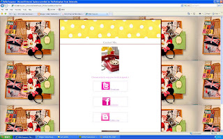
Can't decide if to keep the background the same throughout the website or to change it for each page?
Ideas...


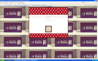


I then saw Simon who I asked what he thought about changing the background he said it was a good idea as it relates to the zone of the website.
visual identity of 'zone' expressed using colour or design
visual communication is about:
communication
visual interest/drama
and the play between the two
for example:

This is the navigation - where you look where to go. i.e my links like home, about, gallery, video & contact.

This is the zone to see where you are & where else you can go.

This is the identity of the page, you know where you are on the website & it is clear to see.
Simon said the backgrounds I use are a bit "busy" which may distract from the content - so I suggested maybe keeping the background the same image but changing the colour of the dots in the box of content.
For example here I have used green dots



Ideas...


I then saw Simon who I asked what he thought about changing the background he said it was a good idea as it relates to the zone of the website.
visual identity of 'zone' expressed using colour or design
visual communication is about:
communication
visual interest/drama
and the play between the two
for example:

This is the navigation - where you look where to go. i.e my links like home, about, gallery, video & contact.

This is the zone to see where you are & where else you can go.

This is the identity of the page, you know where you are on the website & it is clear to see.
Simon said the backgrounds I use are a bit "busy" which may distract from the content - so I suggested maybe keeping the background the same image but changing the colour of the dots in the box of content.
For example here I have used green dots

So far...



Thursday, 14 April 2011
Screenshots So Far..


These are shots of what I have done today, i'm still unsure if this is the theme and colours I will be using but the layout is how I wanted from my wireframes! :)
Wireframes
Here are two wireframe designs for my portfolio, both very simple with a slight different layout of the navigation links:


My reasoning for these designs is; both may look simple layouts but i'm hoping with images, backgrounds and text it will improve the look. I don't want to design anything too complicated that I have to follow as I will end up getting frustrated,I feel if i start with something simple I can always change it once I get more advanced. My navigation links will be a small italic font or I may change this all together and add big swirly font! I am unsure of typography yet. I want a background image & then a box with the information in in the middle of this page. Colour theme will be the same throughout the portfolio & I also now need to design a logo for the left hand corner!


My reasoning for these designs is; both may look simple layouts but i'm hoping with images, backgrounds and text it will improve the look. I don't want to design anything too complicated that I have to follow as I will end up getting frustrated,I feel if i start with something simple I can always change it once I get more advanced. My navigation links will be a small italic font or I may change this all together and add big swirly font! I am unsure of typography yet. I want a background image & then a box with the information in in the middle of this page. Colour theme will be the same throughout the portfolio & I also now need to design a logo for the left hand corner!
Wednesday, 13 April 2011
3 Websites..
3 websites I really like & will have inspiration for my portfolio from.
Kate Nash: http://www.katenash.co.uk/home.php

I love the layout of this & images used. Not everything is boxed in like a normal website. Texts used are very simple but balanced out with abstract images.
Rihanna: http://www.rihannanow.com/

For this one it's clearly the pink colour theme I like :) The contact buttons eg facebook & twitter are in pink which I now want for my portfolio! I also think the logo makes it look proffesional & identity of her is know straight away.
Orange Tree: http://www.orangetree.co.uk/

This one is really effective, different website & probably a bit out of my league to try and copy some aspects such as the navigation but I like how the pictures connect with the link, such as the camera for photo albums, phone for contact & c.d player to control the music on the site.
Kate Nash: http://www.katenash.co.uk/home.php

I love the layout of this & images used. Not everything is boxed in like a normal website. Texts used are very simple but balanced out with abstract images.
Rihanna: http://www.rihannanow.com/

For this one it's clearly the pink colour theme I like :) The contact buttons eg facebook & twitter are in pink which I now want for my portfolio! I also think the logo makes it look proffesional & identity of her is know straight away.
Orange Tree: http://www.orangetree.co.uk/

This one is really effective, different website & probably a bit out of my league to try and copy some aspects such as the navigation but I like how the pictures connect with the link, such as the camera for photo albums, phone for contact & c.d player to control the music on the site.
Interactive
Today was the first day back & I used many codes on dreamweaver to get some ideas for my portfolio. I tried using background images & different div tags which can be seen here:


Friday, 25 March 2011
Digital Me - Moodboard
Today we created a moodboard to reflect our personal interests & describe our personal branding.
Personal Branding:
"is the process whereby people and their careers are marked as brands.It has been noted that while previous self-help management techniques were about self-improvement, the personal branding concept suggests instead that success comes from self-packaging. Further defined as the creation of an asset that pertains to a particular person or individual; this includes but is not limited to the body, clothing, appearance and knowledge contained within, leading to an indelible impression that is uniquely distinguishable. The term is thought to have been first used and discussed in a 1997 article by Tom Peters."
"Personal branding often involves the application of one's name to various products. For example, celebrity real-estate mogul Donald Trump uses his last name extensively on his buildings and on the products he endorses (e.g Trump Steaks)"
http://mashable.com/2009/02/05/personal-branding-101/
"Many people think that personal branding is just for celebrities such as Paris Hilton or Britney Spears, yet each and every one of us is a brand. Personal branding, by definition, is the process by which we market ourselves to others. As a brand, we can leverage the same strategies that make these celebrities or corporate brands appeal to others. We can build brand equity just like them."
This is my moodboard:

I created it on the IMGSPARK website, there is a colour theme of pink - hence being my favourite colour. I like "girly" things such as make up, shoes, my boyfriend. I feel this moodboard portrays me well as someone whom has never spoke to me could guess my personality from this. Doing this moodboard did give me ideas for my portfolio - such as themes I could use, what I want to include in the portfolio & how much I can put onto the portfolio to make it about me as much as possible. I also thought about font & although I love pink - keeping it black & professional will look better!
Personal Branding:
"is the process whereby people and their careers are marked as brands.It has been noted that while previous self-help management techniques were about self-improvement, the personal branding concept suggests instead that success comes from self-packaging. Further defined as the creation of an asset that pertains to a particular person or individual; this includes but is not limited to the body, clothing, appearance and knowledge contained within, leading to an indelible impression that is uniquely distinguishable. The term is thought to have been first used and discussed in a 1997 article by Tom Peters."
"Personal branding often involves the application of one's name to various products. For example, celebrity real-estate mogul Donald Trump uses his last name extensively on his buildings and on the products he endorses (e.g Trump Steaks)"
http://mashable.com/2009/02/05/personal-branding-101/
"Many people think that personal branding is just for celebrities such as Paris Hilton or Britney Spears, yet each and every one of us is a brand. Personal branding, by definition, is the process by which we market ourselves to others. As a brand, we can leverage the same strategies that make these celebrities or corporate brands appeal to others. We can build brand equity just like them."
This is my moodboard:

I created it on the IMGSPARK website, there is a colour theme of pink - hence being my favourite colour. I like "girly" things such as make up, shoes, my boyfriend. I feel this moodboard portrays me well as someone whom has never spoke to me could guess my personality from this. Doing this moodboard did give me ideas for my portfolio - such as themes I could use, what I want to include in the portfolio & how much I can put onto the portfolio to make it about me as much as possible. I also thought about font & although I love pink - keeping it black & professional will look better!
Wednesday, 23 March 2011
Interactive..
Seminar with Giselle today in which we went over the basics of html in dreamweaver. We created an index page & CSS.
We used text codes & added images for backgrounds. I have a rough idea how I want my portfolio to look already.
Also had a look on this website which was good for ideas: http://www.smashingmagazine.com/2009/02/26/10-steps-to-the-perfect-portfolio-website/
Loving the sunshineeeeeeeeeeee!

We used text codes & added images for backgrounds. I have a rough idea how I want my portfolio to look already.
Also had a look on this website which was good for ideas: http://www.smashingmagazine.com/2009/02/26/10-steps-to-the-perfect-portfolio-website/
Loving the sunshineeeeeeeeeeee!

Tuesday, 22 March 2011
Starting Interactive Space! :)
Finalllllllly starting interactive tomorrow which i'm excited about as it was my favourite project last term, i've looked at the other groups blogs of what they have been doing & it does look like something i'll enjoy. Plus i'm hoping to choose it for my pathway next year! :)
Brief from the Now:
Project title: “DIGITAL ME”
Task: You are to design a 5 page interactive website using Adobe Dreamweaver that acts as a digital portfolio and promotional online resource for your artwork. This should display good design principles, a flair forself-promotion and a good understanding of the underlying coding. It should also show an understanding of the importance of networking and linking to social networks.
At your presentation: Submit the Dreamweaver source files (html, swf, etc) on a CDROM along with your presentation file/s.
In your online journal: A 500 hundred word rational describing your design decisions such as screen layout, user interaction and methods used. Provide appropriate references to support your decisions and contextualise your practise.
Influences: You will be given various links to designer and artist websites and online design resources. You should research your own particular interests and design preferences and write these up on a weekly basis in your online journal. We shall be looking for innovative and original lines of enquiry and a willingness to experiment.
Content: Via considering the various elements needed to make an interactive and multimedia website we shall explore the various aspects of incorporating graphics, video, sound and text as well as considering the
audience and social networking aspects of contemporary arts promotion. We will consider various existing designer portfolios and their methods of promotion and distribution. After completing this pathway you will be able to build an interactive and multimedia website for promotional advertising.

Brief from the Now:
Project title: “DIGITAL ME”
Task: You are to design a 5 page interactive website using Adobe Dreamweaver that acts as a digital portfolio and promotional online resource for your artwork. This should display good design principles, a flair forself-promotion and a good understanding of the underlying coding. It should also show an understanding of the importance of networking and linking to social networks.
At your presentation: Submit the Dreamweaver source files (html, swf, etc) on a CDROM along with your presentation file/s.
In your online journal: A 500 hundred word rational describing your design decisions such as screen layout, user interaction and methods used. Provide appropriate references to support your decisions and contextualise your practise.
Influences: You will be given various links to designer and artist websites and online design resources. You should research your own particular interests and design preferences and write these up on a weekly basis in your online journal. We shall be looking for innovative and original lines of enquiry and a willingness to experiment.
Content: Via considering the various elements needed to make an interactive and multimedia website we shall explore the various aspects of incorporating graphics, video, sound and text as well as considering the
audience and social networking aspects of contemporary arts promotion. We will consider various existing designer portfolios and their methods of promotion and distribution. After completing this pathway you will be able to build an interactive and multimedia website for promotional advertising.
Friday, 18 March 2011
Moving Image Evaluation
For this project we were put into groups & given specific roles for the short film. A script was also given to us - ours being "Herds" I was given the role of Assistant Director.
The basic storyline is that a man unknown to what reason he does it - walks about, knocking on people's doors and entering their house like he knows them. They are unsure how to react but him entering & he then proceeds to eating their food in the house.
We changed it slightly in the fact that Agnew is cooking a romantic meal for his girlfriend when Monty knocks on the door. Agnew is portrayed as a very weak character who doesn't know how to handle the fact a strange man is in his home. Monty is very upfront & confident - he drinks the wine & food Agnew prepared. We changed the script as well as it is actually Agnew who lives his own house & lives Monty alone.
My main ideas and intentions that I was trying to express in the project were: That we had been given a script & had interpreted it in our own way as a group – it may not have been how the creator of the script wanted it to be read but how we produced it into a film is how we saw it as a script. Wanted to express the idea that there was something wrong with “Monty” – it’s clearly not normal to do what he was doing but wanted the audience to have their own idea of why he did it. Was he mad, sick, rude? We wanted to create a strong character but at the same time not give too much away about him as a person.
The methods I use to develop my ideas were: (brainstorming, , visual research, storyboards etc) I have blogged all my methods since starting this project that developed my ideas. Being assistant director, I felt this was quite an important part of my role – to keep the group organised. WE created a group blog so we could always blog ideas & updates about our film and give feedback to each other on how well we thought it would work. At the start of the project I created a brainstorm and storyboard – which have changed slightly but this gave us a good insight to the idea we had to follow which made it a lot easier on the day of filming. Me, Joe & Harry also researched into quite a lot of film clips to get inspiration for shot & angle ideas. “Hot Fuzz” with the quick edit gave a tense atmosphere which is what we also wanted to create – so we have adapted this into the start of our film. We also had a seminar about lighting which helped when coming to film as without the lights it does make a big difference on how good the final piece looks. Posters for our film were created in a seminar.
I took a risk by trying something new. (Explain): Normally when working in a group we don’t have roles we are all expected to do the same. I feel having roles & being assistant director did give me more of a chance to suggest my ideas more than I have done in past situations. I liked the role of having to be organised & not just stepping into the background. Although some of the ideas I suggested we didn’t use in the film, we did try them to find they didn’t work very well. For example, Agnew is cooking a dinner for his girlfriend & I suggested her & Monty walking past each other on the stairs when he leaves but it didn’t really fit into what we had filmed already & looked a bit out of place.
Some of the unexpected problems I had to solve while working were: I think at the start of the project we all really had our minds set on the film & did a schedule for what needed to doing & by when. Then we kept putting off filming and in the end when we finally decided on a day to film – our actors couldn’t do that day. The lighting was quite difficult, either too dark or too bright but after a while we did manage to set it to the correct balance. Working in a group is always hard as sometimes people don’t turn up to seminars or can’t make it which was slightly frustrated when we wanted to edit our footage to find the editor wasn’t there.
The decisions and choices I made to help solve these problems were: We improvised on the actors and used Mark & Joe in our group – which doesn’t make the film as effective as it could be. Our group did communicate well through Facebook and texting and we would try and say if we couldn’t make it and then we could do something instead to make up for missing what had been done. For example Harry said he would take charge of finding actors but he then had to go home that weekend so I said I would do it, it wasn’t a problem to have to do it as Harry had let me know in plenty of time.
The things I have learnt from this particular project were: (Specific examples should be cited.) Although it was only a 3 minute film, it takes a lot of work and equipment to make a really good effective final piece. On the first day of filming we thought we could get away without using lights & looking at the footage afterwards it looked pretty bad, it made such a difference when the lighting was used. We have used dialogue which is recorded on the camera and sound effects such as wine being opened, water boiling and plates being used on the microphone and the quality of the sound is a lot better on the microphone. It does take a lot more effort to do it but its better in the long run as the quality of the film when doing it properly makes it so much better. For a 3 minute film we had about 2 hours worth of shots & although we didn’t use a lot of them, I’m glad they were filmed because if we hadn’t of had the right shot it would have been nearly impossible to re shoot it trying to get the same lighting as the previous footage.
Areas for improvement , If I were to do this project again I would change or do differently: I have really enjoyed this project and the group I worked within made me enjoy it. I think if I could do it again I would like to have a different role. I did like being assistant director but I would also like editor, sound or camera in which I could actually get involved and not just give ideas of how to hold the camera but actually be able to do it myself. We have still got the original footage so I may do my own edit of the film to add to my presentation as well as the group edit. I also think the theme and genre is a bit vivid, it is suppose to be a thriller but I think it lacks a little bit in some of the conventions so is also quite hard to pin point a specific audience for the film. I would improve this to make it stronger.
A new project that might grow out of my experience maybe: I liked the fact we got given a script and only had that to work from, if I did choose moving image as my pathway I would like to do adverts/commercials. So could perhaps look at scripts online for adverts that have been produced and film them how I think they should be interpreted to the audience.
The basic storyline is that a man unknown to what reason he does it - walks about, knocking on people's doors and entering their house like he knows them. They are unsure how to react but him entering & he then proceeds to eating their food in the house.
We changed it slightly in the fact that Agnew is cooking a romantic meal for his girlfriend when Monty knocks on the door. Agnew is portrayed as a very weak character who doesn't know how to handle the fact a strange man is in his home. Monty is very upfront & confident - he drinks the wine & food Agnew prepared. We changed the script as well as it is actually Agnew who lives his own house & lives Monty alone.
My main ideas and intentions that I was trying to express in the project were: That we had been given a script & had interpreted it in our own way as a group – it may not have been how the creator of the script wanted it to be read but how we produced it into a film is how we saw it as a script. Wanted to express the idea that there was something wrong with “Monty” – it’s clearly not normal to do what he was doing but wanted the audience to have their own idea of why he did it. Was he mad, sick, rude? We wanted to create a strong character but at the same time not give too much away about him as a person.
The methods I use to develop my ideas were: (brainstorming, , visual research, storyboards etc) I have blogged all my methods since starting this project that developed my ideas. Being assistant director, I felt this was quite an important part of my role – to keep the group organised. WE created a group blog so we could always blog ideas & updates about our film and give feedback to each other on how well we thought it would work. At the start of the project I created a brainstorm and storyboard – which have changed slightly but this gave us a good insight to the idea we had to follow which made it a lot easier on the day of filming. Me, Joe & Harry also researched into quite a lot of film clips to get inspiration for shot & angle ideas. “Hot Fuzz” with the quick edit gave a tense atmosphere which is what we also wanted to create – so we have adapted this into the start of our film. We also had a seminar about lighting which helped when coming to film as without the lights it does make a big difference on how good the final piece looks. Posters for our film were created in a seminar.
I took a risk by trying something new. (Explain): Normally when working in a group we don’t have roles we are all expected to do the same. I feel having roles & being assistant director did give me more of a chance to suggest my ideas more than I have done in past situations. I liked the role of having to be organised & not just stepping into the background. Although some of the ideas I suggested we didn’t use in the film, we did try them to find they didn’t work very well. For example, Agnew is cooking a dinner for his girlfriend & I suggested her & Monty walking past each other on the stairs when he leaves but it didn’t really fit into what we had filmed already & looked a bit out of place.
Some of the unexpected problems I had to solve while working were: I think at the start of the project we all really had our minds set on the film & did a schedule for what needed to doing & by when. Then we kept putting off filming and in the end when we finally decided on a day to film – our actors couldn’t do that day. The lighting was quite difficult, either too dark or too bright but after a while we did manage to set it to the correct balance. Working in a group is always hard as sometimes people don’t turn up to seminars or can’t make it which was slightly frustrated when we wanted to edit our footage to find the editor wasn’t there.
The decisions and choices I made to help solve these problems were: We improvised on the actors and used Mark & Joe in our group – which doesn’t make the film as effective as it could be. Our group did communicate well through Facebook and texting and we would try and say if we couldn’t make it and then we could do something instead to make up for missing what had been done. For example Harry said he would take charge of finding actors but he then had to go home that weekend so I said I would do it, it wasn’t a problem to have to do it as Harry had let me know in plenty of time.
The things I have learnt from this particular project were: (Specific examples should be cited.) Although it was only a 3 minute film, it takes a lot of work and equipment to make a really good effective final piece. On the first day of filming we thought we could get away without using lights & looking at the footage afterwards it looked pretty bad, it made such a difference when the lighting was used. We have used dialogue which is recorded on the camera and sound effects such as wine being opened, water boiling and plates being used on the microphone and the quality of the sound is a lot better on the microphone. It does take a lot more effort to do it but its better in the long run as the quality of the film when doing it properly makes it so much better. For a 3 minute film we had about 2 hours worth of shots & although we didn’t use a lot of them, I’m glad they were filmed because if we hadn’t of had the right shot it would have been nearly impossible to re shoot it trying to get the same lighting as the previous footage.
Areas for improvement , If I were to do this project again I would change or do differently: I have really enjoyed this project and the group I worked within made me enjoy it. I think if I could do it again I would like to have a different role. I did like being assistant director but I would also like editor, sound or camera in which I could actually get involved and not just give ideas of how to hold the camera but actually be able to do it myself. We have still got the original footage so I may do my own edit of the film to add to my presentation as well as the group edit. I also think the theme and genre is a bit vivid, it is suppose to be a thriller but I think it lacks a little bit in some of the conventions so is also quite hard to pin point a specific audience for the film. I would improve this to make it stronger.
A new project that might grow out of my experience maybe: I liked the fact we got given a script and only had that to work from, if I did choose moving image as my pathway I would like to do adverts/commercials. So could perhaps look at scripts online for adverts that have been produced and film them how I think they should be interpreted to the audience.
Subscribe to:
Posts (Atom)