Ideas...
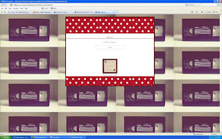
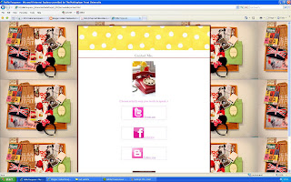
I then saw Simon who I asked what he thought about changing the background he said it was a good idea as it relates to the zone of the website.
visual identity of 'zone' expressed using colour or design
visual communication is about:
communication
visual interest/drama
and the play between the two
for example:
This is the navigation - where you look where to go. i.e my links like home, about, gallery, video & contact.
This is the zone to see where you are & where else you can go.
This is the identity of the page, you know where you are on the website & it is clear to see.
Simon said the backgrounds I use are a bit "busy" which may distract from the content - so I suggested maybe keeping the background the same image but changing the colour of the dots in the box of content.
For example here I have used green dots
So far...


No comments:
Post a Comment