Thinking about ideas for brief one in dp3 - Voyage.
Voyage: A long journey by sea or space. No limit or imagination. A website in which I can pretty much do what I want. Can be a voyage of anything. Be original.
Thinking about journey I went on in September to Thailand. Colour themes I could use for this:
http://colorschemedesigner.com/
http://kuler.adobe.com
Depending on my audience my website would either be quite formal or could be really informal.
Travellers / Older Audience: Use maps & images to show and talk formally about Thailand, the culture and food etc.
Friends/Family/Travelling Students: Make less formal & more fun. Can include photos of self. Still talk about culture but also own opinions of country.
I'm undecided on my audience yet but going make wireframes for both audiences & see what I think works best.
Friday, 28 October 2011
Color Or Colour Theory?
http://www.logocritiques.com/resources/color_psychology_in_logo_design/
"Color offers an instantaneous method for conveying meaning and message in your logo designs. It’s probably the most powerful non-verbal form of communication we can use as designers. Our minds are programmed to respond to color. The subliminal messages we get from color shape our thoughts. As humans our very survival is hung on the identification of color. We stop our cars for red lights and go on green, we look at the color of certain plants and animals to determine whether or not they are safe for us to eat or touch, the bottom line is that color is a very important part of our daily lives. It’s important for us as designers to use color appropriately and understand the meaning behind the colors we choose."
Red: aggressiveness, passion, strength and vitality.
Pink: femininity, innocence, softness and health.
Orange: fun, cheeriness and warm exuberance.
Yellow: positivity, sunshine and cowardice.
Green: tranquility, health and freshness.
Blue: authority, dignity, security and faithfulness.
Purple: sophistication, spirituality, costliness, royalty and mystery.
Brown: utility, earthiness, woodsy-ness and subtle richness.
White: purity, truthfulness, being contemporary and refined.
Gray: somberness, authority, practicality and a corporate mentality.
Black: seriousness, distinctiveness, boldness and being classic.
http://www.instantshift.com/2009/01/29/20-corporate-brand-logo-evolution/
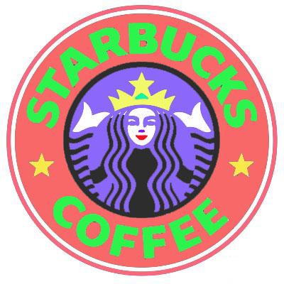
Change the colours of a well know logo:
http://logodesignerblog.com/how-to-use-colour-in-logo-design/
"Color offers an instantaneous method for conveying meaning and message in your logo designs. It’s probably the most powerful non-verbal form of communication we can use as designers. Our minds are programmed to respond to color. The subliminal messages we get from color shape our thoughts. As humans our very survival is hung on the identification of color. We stop our cars for red lights and go on green, we look at the color of certain plants and animals to determine whether or not they are safe for us to eat or touch, the bottom line is that color is a very important part of our daily lives. It’s important for us as designers to use color appropriately and understand the meaning behind the colors we choose."
Red: aggressiveness, passion, strength and vitality.
Pink: femininity, innocence, softness and health.
Orange: fun, cheeriness and warm exuberance.
Yellow: positivity, sunshine and cowardice.
Green: tranquility, health and freshness.
Blue: authority, dignity, security and faithfulness.
Purple: sophistication, spirituality, costliness, royalty and mystery.
Brown: utility, earthiness, woodsy-ness and subtle richness.
White: purity, truthfulness, being contemporary and refined.
Gray: somberness, authority, practicality and a corporate mentality.
Black: seriousness, distinctiveness, boldness and being classic.
http://www.instantshift.com/2009/01/29/20-corporate-brand-logo-evolution/
Change the colours of a well know logo:
http://logodesignerblog.com/how-to-use-colour-in-logo-design/
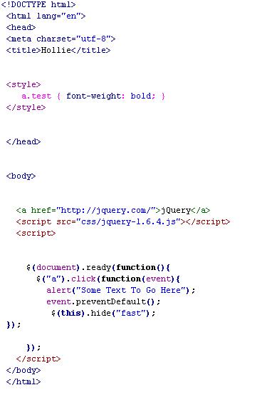
JQuery
"jQuery is a fast and concise JavaScript Library that simplifies HTML document traversing, event handling, animating, and Ajax interactions for rapid web development. jQuery is designed to change the way that you write JavaScript."
http://jquery.com/
http://jquery.com/
Tuesday, 25 October 2011
Network Diagram For Context 2 & Stuffffff
Here's my network diagram for my report:
(to be uploaded)
Found my companies I will be using & contacted them. Also have a list of the rejected companies & why I rejected them.
Also done intro & abstract & started to write up about each company.
(to be uploaded)
Found my companies I will be using & contacted them. Also have a list of the rejected companies & why I rejected them.
Also done intro & abstract & started to write up about each company.
Monday, 24 October 2011
Context 2
A website I really like the design of:
http://fatburgr.com/
Designed by one of the companies I rejected for the essay.
http://fatburgr.com/
Designed by one of the companies I rejected for the essay.
Friday, 21 October 2011
Week 3 Task: Find 5 Design Principles
Individually search the web for websites which display the five design principles detailed in the handout:
Alignment:Alignment creates a sharper, more ordered design. Aligning elements allows them to create a visual connection with each other. It tightens the design and eliminates the haphazard, messy effect which comes when items are placed randomly. Aligning elements which are not in close proximity with each other, helps to provide an invisible connection between them. Alignment is one of the most basic and important principles of design. It allows us to create order and organisation among elements.
Repetition:Repetition strengthens a design by tying together individual elements. It helps to create association and consistency.
The consistent repetition of an element is widely used in multi-page documents & websites.
Elements can be as simple as colour, shapes, typefaces or even texture.
Contrast:Contrast allows you to emphasize or highlight key elements within your design. Contrast is created when two elements are total opposites.
This doesn’t necessarily have to be colours either. It can be achieved with fonts (classic/contemporary), lines (thick/thin) and shapes (big/small), just to name a few.
Contrast plays a crucial part in the organisation of information on a page. It will guide the reader to where they should look first or to the most important element.
For it to work successfully though, it must be strong and obvious. It needs to make an impact.
Proximity:Proximity helps creates organisation.
By grouping similar elements together or in close proximity, you create a relationship between those elements. It also provides a focal point and can give the reader and idea of where they should start and finish reading.
Proximity doesn’t mean that elements have to be placed together, it means they should be visually connected in someway. This can be by use of point size, font, colour etc.
Balance:Balance provides stability and structure to a design. It’s the weight distributed in the design by the placement of your elements. The elements don’t necessarily need to be of the same size. Balance can be achieved by placing a large element on one side of your design and several small elements on the other side.
Balance can be achieved in 2 ways, either Symmetrical or Asymmetrical.
Symmetrical balance is achieved when the weight of the elements on both halves of the design is even, given a centre line.
Asymmetrical balance is achieved by the use of contrast. A dark element would need to be balanced by several lighter elements.
Alignment Repetition Contrast Proximity Balance
Alignment:Alignment creates a sharper, more ordered design. Aligning elements allows them to create a visual connection with each other. It tightens the design and eliminates the haphazard, messy effect which comes when items are placed randomly. Aligning elements which are not in close proximity with each other, helps to provide an invisible connection between them. Alignment is one of the most basic and important principles of design. It allows us to create order and organisation among elements.
Repetition:Repetition strengthens a design by tying together individual elements. It helps to create association and consistency.
The consistent repetition of an element is widely used in multi-page documents & websites.
Elements can be as simple as colour, shapes, typefaces or even texture.
Contrast:Contrast allows you to emphasize or highlight key elements within your design. Contrast is created when two elements are total opposites.
This doesn’t necessarily have to be colours either. It can be achieved with fonts (classic/contemporary), lines (thick/thin) and shapes (big/small), just to name a few.
Contrast plays a crucial part in the organisation of information on a page. It will guide the reader to where they should look first or to the most important element.
For it to work successfully though, it must be strong and obvious. It needs to make an impact.
Proximity:Proximity helps creates organisation.
By grouping similar elements together or in close proximity, you create a relationship between those elements. It also provides a focal point and can give the reader and idea of where they should start and finish reading.
Proximity doesn’t mean that elements have to be placed together, it means they should be visually connected in someway. This can be by use of point size, font, colour etc.
Balance:Balance provides stability and structure to a design. It’s the weight distributed in the design by the placement of your elements. The elements don’t necessarily need to be of the same size. Balance can be achieved by placing a large element on one side of your design and several small elements on the other side.
Balance can be achieved in 2 ways, either Symmetrical or Asymmetrical.
Symmetrical balance is achieved when the weight of the elements on both halves of the design is even, given a centre line.
Asymmetrical balance is achieved by the use of contrast. A dark element would need to be balanced by several lighter elements.
Introduction To Javascript
In todays lecture with David we started Javascript.
"Javascript is an easy-to-use programming language that can be embedded in the header of your web pages. It can enhance the dynamics and interactive features of your page by allowing you to perform calculations, check forms, write interactive games, add special effects, customize graphics selections, create security passwords and more."
http://www.webteacher.com/javascript/
http://www.w3schools.com/js/default.asp
We learnt some simple codes to start with such as how to say hello:
< html >
< body >
< script language="javascript" >
document.write('Hello');
< /script >
< /body>
< /html >
& how to repeat a word however amount of times, here shows x 6 times. Could change it to any number:
< html >
< body >
< script language="javascript" >
row=0;
while (row<6) { document.write("X "); row=row+1; } < /script >
< /body >
< /html >
We then had the task to ask the user to guess a number and tells the
user if it is high, low or bulls eye. We had to read through online tutorials to find this. I found it quite difficult, although reading through it online meant I could try other codes such as pop up box & loops.
The simple codes such as "hello" and repeating it in sequence was quite easy to grasp however I stuggled with the harder stuff so going to read it on w3schools this week & try to get my head around it all.
"Javascript is an easy-to-use programming language that can be embedded in the header of your web pages. It can enhance the dynamics and interactive features of your page by allowing you to perform calculations, check forms, write interactive games, add special effects, customize graphics selections, create security passwords and more."
http://www.webteacher.com/javascript/
http://www.w3schools.com/js/default.asp
We learnt some simple codes to start with such as how to say hello:
< html >
< body >
< script language="javascript" >
document.write('Hello');
< /script >
< /body>
< /html >
& how to repeat a word however amount of times, here shows x 6 times. Could change it to any number:
< html >
< body >
< script language="javascript" >
row=0;
while (row<6) { document.write("X "); row=row+1; } < /script >
< /body >
< /html >
We then had the task to ask the user to guess a number and tells the
user if it is high, low or bulls eye. We had to read through online tutorials to find this. I found it quite difficult, although reading through it online meant I could try other codes such as pop up box & loops.
The simple codes such as "hello" and repeating it in sequence was quite easy to grasp however I stuggled with the harder stuff so going to read it on w3schools this week & try to get my head around it all.
Thursday, 20 October 2011
Wednesday, 19 October 2011
Voyage - DP3 Brief
Shaun gave us the basic brief for our first interactive project "Voyage" - to be completed by end of first term.
I have to create a 5 page website that is validated to wc3 standards & includes at least 3 interactive Java script routines that enhance the interactive experience.
Voyage: A long journey by sea or space. No limit or imagination. A website in which I can pretty much do what I want. Can be a voyage of anything. Be original.
Some very rough ideas for a theme:
I have to create a 5 page website that is validated to wc3 standards & includes at least 3 interactive Java script routines that enhance the interactive experience.
Voyage: A long journey by sea or space. No limit or imagination. A website in which I can pretty much do what I want. Can be a voyage of anything. Be original.
Some very rough ideas for a theme:
Contacting Web Design Companies
I have now contacted 25 web design companies in hope I will get a reply from quite a few so I can talk about 2 in my essay & then still have some to talk about for the rejected companies.
There are a few I reallllllly like & really hope they get in contact
it's so cold.
There are a few I reallllllly like & really hope they get in contact
it's so cold.
Subscribe to:
Posts (Atom)