Showing posts with label Interactive Pathway. Show all posts
Showing posts with label Interactive Pathway. Show all posts
Thursday, 2 February 2012
Mobile App Design
Today in groups we designed a new app that hasn't already been made. We thought of the non smoking apps in which help to quit smoking. We came up with the idea of tracking and having a diary of how much you drink, what you drink and hopefully it will help people whom drink a lot to cut down and then eventually quit.

Monday, 30 January 2012
Context 2 Portfolio Inspirations
http://inspirationti.me/websites/blogs
have been looking on this website for some ideas for my portfolio for context 2.
all of the designs are really creative and look amazing but I want a scrolling website and can't find any good ones to show.
Need to make a moodboard to help with ideas for it..
have been looking on this website for some ideas for my portfolio for context 2.
all of the designs are really creative and look amazing but I want a scrolling website and can't find any good ones to show.
Need to make a moodboard to help with ideas for it..
Friday, 27 January 2012
Restuarant Re Design Task - Evaluation
For this project we were set the task to redesign a restaurant website consisting of 5 link pages & javascript.
I decided to redesign the Dunton Bassett Arms public house and chinese restaurant website. http://www.duntonbassettarms.co.uk/
The Dunton Bassett Arms website is very basic with a lack of creativity to make the customers warm to the restaurant. Text and photos are put anywhere on the page and the plain background doesn't go well with the font colours used.
My main ideas and intentions for this website redesign was to make it more slick, with a colour theme that suited both well to a pub and restaurant and to make it have more of a professional level.
The methods I use to develop my ideas were looking at other restaurant websites to gain ideas and inspiration. I created wireframes and all the development of the website can be seen on my blog.
I have added a logo to the site, only very basic but something to credit the pub/restuarant. I have kept the content the same although it could be changed to a more professional level instead of "Hi i'm Rob."
The colour scheme is black, white and red which compliments well with both the public house and chinese restaurant. I think the colours fit well for both male or female customers.
I want to do a scrolling website although thought it wasn't practical for a restaurant site - in which it needs to have basic navigation. I am hoping to do scrolling for my context 2 project.
I'd like to change the menu page, I used the same image as the original website so it has the same green colour scheme as that and looks really out of place on my site. The only reason for this is that there were so many items on the menu to re write a new list. I am critical of it & know personally the menu doesn't look great.
I added a calender to the contact page as I wanted to do a "book now" but this took me so long to try and figure out how to do & when I did finally do it none of the other links worked. It would look better if it has the "book now" on the site.
I have checked my website works in all internet pages eg firefox, internet explorer, safari & google chrome.
Areas for improvement , If I were to do this project again I would change or do differently: I think the background is slightly depressing being black so maybe change the colours & I think a font more suitable for a restaurant site could be used. It does look slightly boring in which it is just boxes but I'm hoping my context 2 project will allow me to be more diverse and explore into more options.
Thursday, 26 January 2012


Tuesday, 24 January 2012
Restaurant Task

The Dunton Bassett Arms website is very basic with a lack of creativity to make the customers warm to the restaurant. Text and photos are put anywhere on the page and the plain background doesn't go well with the font colours used.
I have added a logo to the site, only very basic but something to credit the pub/restuarant. I have kept the content the same although it could be changed to a more professional level instead of "Hi i'm Rob."
The colour scheme is black, white and red which compliments well with both the public house and chinese restaurant. The menu was really long so I have just saved it as an image in which the user can get to via hyperlink. Ideally I would like the menu the same design as the website but the amount of text will take forever but I am critical of it & know personally the menu doesn't look great. Contact details need a page! include facebook, phone and address. Appeals to both male & female.
Sunday, 22 January 2012
Restaurant Task
Really struggling with this task. All I can do is use boring box templates which look the same every time I do an assignment. I know exactly how I want to redesign The Dunton Bassett Arms website but when it comes down to coding I am so stuck.
The colour of the website is boring, it has no feel/character to it. With a decent background and a change of photos on the site it could look good.
Know i'm on the wrong course and really trying my best but feel like giving up right now.
The colour of the website is boring, it has no feel/character to it. With a decent background and a change of photos on the site it could look good.
Know i'm on the wrong course and really trying my best but feel like giving up right now.
Friday, 20 January 2012

Restaurant Redesign Task Inspiration
My website that i've coded looks so boring and similar to ones i've done before. Looking at others helps me have loads of ideas for what to do but pretty clueless how to code them..

http://www.nuevo-aurich.de/

http://www.thelittlecakeparlour.co.uk/

http://www.giraffe.net/classic/menus

http://www.monkeynuts.biz/menu.html

http://www.nuevo-aurich.de/

http://www.thelittlecakeparlour.co.uk/

http://www.giraffe.net/classic/menus

http://www.monkeynuts.biz/menu.html
Restaurant Redesign Task
Started coding for the redesign of the website The Case. Last night I went to my local pub/Chinese and went online to see their site and have now scrapped all my first initial ideas and am going to redesign The Dunton Bassett Arms (DBA) pub and Chinese restaurant website.


The design of the website is very basic and as I know the landlord I can go in and take photos and discuss what he would like to be done with the site.


The design of the website is very basic and as I know the landlord I can go in and take photos and discuss what he would like to be done with the site.
Thursday, 19 January 2012
CSS3
http://www.css3.info/
http://findmebyip.com/litmus/
http://www.quirksmode.org/css/contents.html
http://findmebyip.com/litmus/
http://www.quirksmode.org/css/contents.html
Tuesday, 17 January 2012
Restaurant Redesign Task
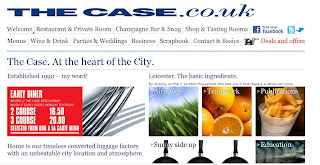
I've chosen to design The Case website. I have been here many times although never looked at the site. I feel the website doesn't give the place itself justice.


Monday, 16 January 2012
Net Magazine
In tutorial Shaun gave us each a copy of net magazine to read and blog about.

My copy of net.
This issue


My copy of net.
This issue


Thursday, 12 January 2012
2 Week Project
We have a two week project due in jan 27th. We have to find a restaurant near by and re design the website.
Friday, 9 December 2011
Constantine & Lockwood.
DP3 – Voyage Evaluation.
My brief was to create a 5 page website, validated to WC3 standards and includes at least 3 interactive JavaScript routines that enhance the interactive experience.
I brainstormed a few ideas together for a theme; learning to drive, Thailand, birth to adult, theme park trip, Zante. I decided to go with Thailand as I personally found it the most exciting and thought I could portray this well into the task set. I needed to be able to tell this theme as a narrative.
The methods I used to develop my ideas can all be seen on my blog posts over the duration of the project. I created wire frames which both looked like simple layouts but with images, backgrounds and text it improved the look. I didn’t want to design anything too complicated that I had to follow as I wouldn’t have been able to follow through with that design, I started with something simple that changed along the way as I got more advanced. I created mind maps to enhance ideas as well as a time chart to allow myself to work to reach the deadline. I also received feedback from my audience and peers which allowed me to improve my work.
Problems that rose for me in this project were that the idea I had, may not have been as great as I thought it was to start with. It was all a very personal experience and found the only thing I could share with this was words put into text and photos – which I worried would become very boring for the audience. The audience being friends and family, as I could keep the page quite informal and more about my holiday than if it was targeted at travellers and students looking to travel. I tried to overcome this with JavaScript to make it more interactive, I did however struggle with using JavaScript and didn’t manage to create as much interactivity as I wanted – such as games to play. Compared to my peers websites I feel mine is very basic however I do feel I have improved on my skills since my last interactive project.
Things I have learnt from this particular project are skills such as using CSS, JavaScript and JQuery which I didn’t use in the first year. As I said I did struggle with some parts of the JavaScript but online tutorials did help me. Looking at other websites really helped inspire me into colours to use, image to text ratio & layout. I think it’s also important to try a few different layouts to see what’s best. For example I tried putting text and images in different places on the page to see what looked best as the final design. Also it was important to check my website worked in all internet pages eg firefox, internet explorer, safari & Google chrome as some people in my group had problems with this - mine works in all.
Personally, I am happy with the final design of this project. However compared to other people in the class I am disappointed with it. I find coding very hard and wish I had skills such as illustrations so I could draw more images and put them into the webpage to make it look more creative. I would like to have another go at this project in my own time to make improvements and would like to change it so it’s a scroll down website, which I think is becoming more popular to use on the web now.
In Terms Of Constantine & Lockwood.
1. The structure principle.
My design is organized in a meaningful and useful way in which the navigation is in order of the places in Thailand visited from dates arrived. Photos and content that relate to each place are on that page and this is very clear for the user to recognise. Things that relate are on the same page, things that don’t relate are on separate pages. I have used cartoon images on each page that for me relate to that part of the holiday, an elephant for Phuket, island for Phi Phi, cocktails for ladyboys and a rain cloud for Bangkok.
2. The simplicity principle.
My design is simple to look at and simple to use. Tasks are simple to do and the website provides good shortcuts that are meaningfully related to longer procedures such as a homepage button at the bottom of each page. The navigation is simple to use, placed at the top and each page is a different link. On reflection I now wish I had used the scroll effect website in which each link on the navigation is just a scroll down. I think this looks more effective and can be used better on tablets than the basic website can.
3. The visibility principle.
This meaning that the design shouldn’t distract the user with too many images, colour of text. Don’t confuse them with unneeded content. I have stuck well to this. There is the same logo throughout the webpage, headings and texts that relate well to the name of each page and a few images that relate to the page such as an elephant for Phuket. I used Adobe Kuler to make a colour chart for a “Thailand Theme.” The colours are very neutral and I think fit in well to the theme of the Voyage. I think I have balanced text to image ratio well & nothing is too overpowering for the user.
4. The feedback principle.
Keeping the users up to date, as it happened in the past this is easy to do whilst creating the site. It is also easy to add bits and pieces in when I want to, or change photos and the design around when I get bored of it. My audience – such as friends and family have seen the website I created and gave positive feedback, if I change the design then I would again ask their opinions and work around the best interest of them.
5. The tolerance principle.
Planning my project well would have meant reducing the cost of making mistakes and errors. The design needs to be flexible and tolerant. Familiarising myself with the software Dreamweaver meant I could test a code out and if it didn’t work be able to undo that without causing any major problems to my webpage.
6. The reuse principle.
My site should be able to let the user reuse the site and each page without having to think how to use it and having to remember what that are looking at exactly. I have clearly stuck to the Thailand theme throughout and the design is simple enough for the user to reuse it without any problems.
Completed Voyage
My finished voyage project, not quite how I would have liked it to turn out but it's okkkk..


Wednesday, 7 December 2011
Javascript
here is a rollover mouse image that changes on the "ladyboy" page for the user to guess what images are ladyboys and what aren't. Image changes to a tick or cross to show if they are or not.


Sunday, 4 December 2011
Voyage, Less Than A Week To Go
Voyage is looking ok. Not the happiest with it but it will do.
Need To:
- Add another element of javascript
- Sort font out
- Check errors
Currently doing evaluation..
Can't wait for this term to be over.
Need To:
- Add another element of javascript
- Sort font out
- Check errors
Currently doing evaluation..
Can't wait for this term to be over.
Friday, 2 December 2011
Going Slightly Better Than Yesterday..
Still not brilliant, very very average but at least I have something & also have 2 bits of javascript so need one more to meet the brief.
Very simple structure & working from that, still have a lot to do, considering there's only a week left.


Very simple structure & working from that, still have a lot to do, considering there's only a week left.


Monday, 28 November 2011
Voyage
Hmmm not going too well, I hate my idea, I hate the design of the website & hate how good everyone else is in the class compared to me. Some screen shots of what i've done so far:
Yet to add javascript :(
Yet to add javascript :(
Thursday, 24 November 2011
Accessibility & Validation
Accessibility:
To put the Internet and its services at the disposal of all individuals, whatever their hardware or software requirements, their network infrastructure, their native language, their cultural background, their geographic location, or their physical or mental aptitudes.
Tim Berners-Lee, director of the W.3.C (World Wide Web Consortium)
Accessibility is the degree to which anyone can access and use a website using any web browsing technology. A fully accessible site is one that is designed to make use of the latest web technologies such as multimedia, while at the same time accommodating the needs of those who have difficulty with or are unable to use these technologies.
http://www.rnib.org.uk
http://validator.w3.org/
Subscribe to:
Posts (Atom)