


Produce a portfolio that showcases your development as a multimedia practitioner. It is expected that you will use work produced for your Multimedia Pathway, and any external multimedia work you may have done or be doing, to frame the demonstration of your development. Your portfolio should contain finished pieces but should also show work in progress and your design development process.
The methods I used to develop my ideas can all be seen on my blog posts over the duration of the project. I created wire frames which both looked like simple layouts but with images, backgrounds and text it improved the look. I created mind maps to enhance ideas as well as a time chart to allow myself to work to reach the deadline. I also received feedback from my audience and peers which allowed me to improve my work. I created a mood board of images that represented me that I could use for themes, colours and ideas. I wanted to create something that people who know me could look at the portfolio and relate it to me. Pink themes, swirly fonts and simple images are used as I think this represents me well for my portfolio.
Problems that rose for me in this project were that the I wanted to create a scrolling website but the code conflicted with other javascript on the page I had for other things such as moving images. I had to decide what elements were more important to have in order for the code to work on the page. Compared to my peers websites I feel mine is very basic however I do feel I have improved on my skills since my last interactive project such as coding and javascript.
Things I have learnt from this particular project are skills such as using CSS, JavaScript and JQuery which I didn’t use in the first year. As I said I did struggle with some parts of the JavaScript but online tutorials did help me. Looking at other websites really helped inspire me into colours to use, image to text ratio & layout.
It was important to check my website worked in all internet pages eg firefox, internet explorer, safari & Google chrome as some people in my group had problems with this - mine works in all. Internet explorer isn’t the most recent update so the fonts used and some javascript don’t work as well as they should.
Personally, I am happy with the final design of this project. However compared to other people in the class I am disappointed with it. I find coding very hard and wish I had skills such as illustrations so I could draw more images and put them into the webpage to make it look more creative. I am going to improve on this site after the deadline date to get an up and running portfolio online.
In Terms Of Constantine & Lockwood.
1. The structure principle.
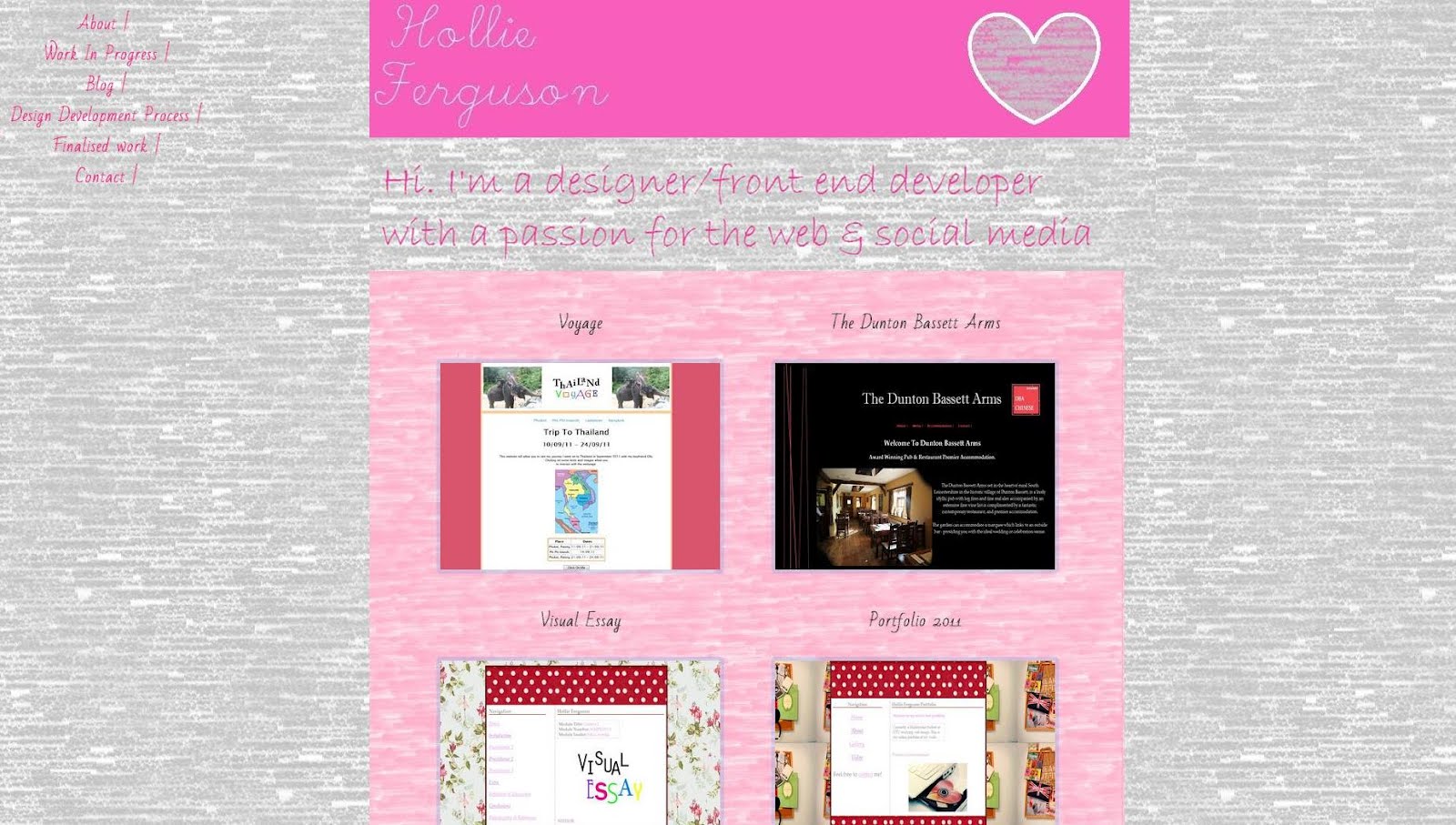
My design is organized in a meaningful and useful way in which the navigation is in order of a portfolio, about me, work, work in progress and contact. Photos and content that relate to each heading are on that page and this is very clear for the user to recognise. Things that relate are on the same page, things that don’t relate are on separate pages. I have used a lightbox j query code to organise my work.
2. The simplicity principle.
My design is simple to look at and simple to use. Tasks are simple to do and the website provides good shortcuts that are meaningfully related to longer procedures such as a fixed navigation. I’m happy I took the time to learn about the scrolling website as I think it adds more interest to the page.
3. The visibility principle.
This meaning that the design shouldn’t distract the user with too many images, colour of text. Don’t confuse them with unneeded content. I have stuck well to this. There is the same colour scheme throughout the webpage, headings and texts that relate well to the name of each page and a few images that relate to the pages such as a photo for me on the about page. I think I have balanced text to image ratio well & nothing is too overpowering for the user.
4. The feedback principle.
Keeping the users up to date, I have past work, current work and will continue to upload work. It is easy to add bits and pieces in when I want to, or change photos and the design around when I get bored of it.
5. The tolerance principle.
Planning my project well would have meant reducing the cost of making mistakes and errors. The design needs to be flexible and tolerant. Familiarising myself with the software Dreamweaver meant I could test a code out and if it didn’t work be able to undo that without causing any major problems to my webpage.
6. The reuse principle.
My site should be able to let the user reuse the site and each page without having to think how to use it and having to remember what that are looking at exactly.
No comments:
Post a Comment